Benefits of using Similarity Distribution Chart
In each data matching task, primary goal is to define a fuzzy data matching model that can separate true matches from true non-matches with minimal number of false matches being retrieved in the resultset.
QDeFuZZiner software provides a powerful feature of generating similarity distribution chart for a data matching model, which provides useful insight into the distribution of matches and non-matches, with two purposes:
1. To provide insight into overall quality of the data matching model
2. To help us in determining optimum similarity threshold to discern matches from non-matches.
We will demonstrate how similarity distribution chart can help us in assessing data matching model and determining optimum similarity threshold, by comparing similarity distribution charts for two alternative data matching models for same input datasets.
Both models were good enough to provide accurate results, but one of the models was much better.
Comparing two data matching models for same input datasets
Prerequisite to be able to generate similarity distribution chart is that we have already defined fuzzy data matching model and executed the first step "1. Execute Blocking Phase" in the 3-step approach.

After the first step (execution of blocking phase) is done, we can generate graph by clicking "2. Analyze Similarity Function Distribution" button.

Data Matching Model A
The following parameters and fuzzy matching constraints were used in the model A:


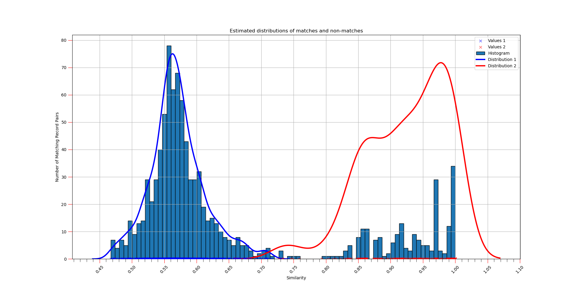
The similarity distribution chart(s) for the model A looked like this:

Data Matching Model B
The following parameters and fuzzy matching constraints were used in the model B:


The similarity distribution chart(s) for the model B looked like this:


Conclusion
Comparing the similarity charts for two alternative data matching models, we can clearly see that the model B is much better in separation of non-matches distribution (normal distribution on left side) from distribution of matches (right side on graph).
It was also much easier to determine appropriate similarity threshold for the model B, because we can see clear breaking point between the two distributions.
Similarity Distribution Chart is invaluable tool provided in the QDeFuZZiner software that can help you to assess overall quality of a data matching model and help you determine optimum similarity threshold for the model.
Further Reading
Introduction To Fuzzy Data Matching
Data Matching Flow
Managing QDeFuZZiner Projects
Importing Input Datasets into QDeFuZZiner
Managing QDeFuZZiner Solutions
Demo Fuzzy Match Projects
Our Data Matching Services
Do you wish us to perform fuzzy data matching, de-duplication or cleansing of your datasets?
Check-out our data matching service here: Data Matching Service